Access the Revenue Dashboard and gain valuable insights of your sales over time
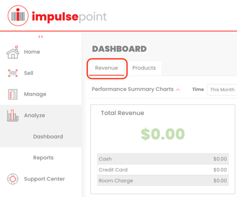
Begin by selecting the "Analyze" icon situated on the left side of the screen. Next, select the "Dashboard" icon just below the "Analyze" icon. Select the "Revenue" tab on the top left corner of the screen.
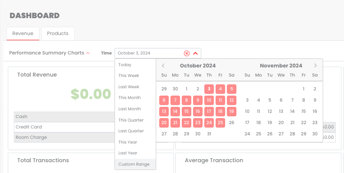
By default, the Revenue Dashboard will display metrics from the current month. Click on the dropdown menu next to "Time" to select which time frame you wish to analyze.
The Revenue Dashboard will provide performance summary charts for the selected time period, including:
- Total Revenue - Includes tax revenue. Broken out by cash, credit card, or room charge.
- ShopPoP Revenue - Revenue brought in through your guest-facing, self-service kiosk.
- Discounts by Type
- Giveaway by Type
- Total Transactions
- Average Transaction ($$ amount)
- Gross Profit
- Profit Margin
- Revenue by Period Graph - The green line indicates this selected time period vs the previous one in blue.
- Profit by Period Graph - The green line indicates this selected time period vs the previous one in blue.
- Revenue by Period: Brand Comparison - The green line indicates your store's revenue for the selected time period, while the blue line indicates the average revenue of other properties within the same brand as yours. Ex - Your Hilton Garden Inn vs all other Hilton Garden Inns.
- Revenue by Period: Segment Comparison - The green line indicates your store's revenue for the selected time period, while the blue line indicates the average revenue of other similar properties. Ex - Your Hilton Garden Inn vs all other Select Service properties.
The last chart on the Revenue Dashboard is a break down of sales per the selected time period, displaying:
- Date
- Retail Sales
- Discounts | Promos
- Service Fees
- Tax
- Total Revenue
- Tips
- Cost of Goods Sold, or COGS
- Giveaways
- Gross Profit
- SPOR (Sales Per Occupied Room)
Tip: Use the "Export" function to export the table to Excel for further analysis and record-keeping.


